The Gerald Anthony Furniture Trust
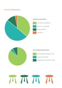
8 page booklet
Website Homepage Mock-up
Business card
Letterhead
REFLECTION
Following feedback from my tutor, I have taken the opportunity to re-design a few parts of this booklet. It hadn’t occurred to me that a “double logo” is potentially confusing. With this in mind, I re-designed the front cover and included the date prominently as its an annual report, which presumably would be issued yearly! Inside is the financial summary for 2014 – I think this is correct, as it would be the previous financial year. I have also added a few more photos, but I am still assuming the charity would not be providing many pictures, and suitable free creative commons imagery isn’t always in abundance. It can also take time to photoshop any images to increase their suitability (for example I have isolated the picture of the lamp onto a plain white background). This takes time, and consequently costs the charity more money.
However, I would suggest that they may want to consider purchasing a small amount of stock photography. For example this image from istockphoto.com, but it would depend on their budget.
http://www.istockphoto.com/photo/orange-chair-3511635?st=a957fcd
My mock up using their comp. You could argue this picture looks a little too much like a furniture catalogue, and may have too much of a commercial feel.
My updated booklet (Given the time, I would have completely removed the double logo from all areas, including the stationary, but hopefully this is a step in the right direction)
Having settled on a re-design, I decided the final step for me was to approach a printer and get a quote for having my booklet professionally printed. They were extremely helpful, and talked over the options. Here’s a photo taken with my mobile phone of the various booklets they showed me, ranging from a 250/130 weight cover/inner pages, to 350/160, in uncoated, gloss or silk. It was really helpful to actually handle some examples, and literally get a feel for the options available. I chose a heavier weight, as the the printer explained that it would create more stability for the small number of pages in the document .Obviously if this was for a real client, they would need to decide on the budget available for printing, which would effect my decision.
Printer samples, photo taken at their office.
I decided to take the plunge and actually go ahead with the print, as it wasn’t a large amount of money, and it just feels like the best way to learn! The results will be posted for assessment. I’m pleased with the booklet, but I would stress that it’s printed on a heavier weight paper, which could be an issue for a charity budget. There is also likely to be some scuffing on the spine after only a small amount of use., due to the flat colour and paper thickness. It’s a little over the top to use a professional printer, but I’m happy to have learnt from it.


